Choosing a new color scheme for your kitchen may seem to be a routine task, there are quite a number of things to consider before taking that brush to your walls. Simply dashing a neutral off-white across the space may appear to be the logical solution–and may be–but, even within the palettes of off-whites, care has to be taken to avoid violating some of the primary rules of color balance. Although you may have your mind set on proudly displaying your grandmother’s cookie jar on your new countertop, you may have to integrate a different window dressing that will compliment the texture of the cookie jar in order to pull-off its inclusion in the scheme. This finishing process of choosing kitchen colors and textures can sound like an impossible or arduous task, but following a few remedial rules of décor will get you right where you need to be.
The Major Influence of Light on Kitchen Colors
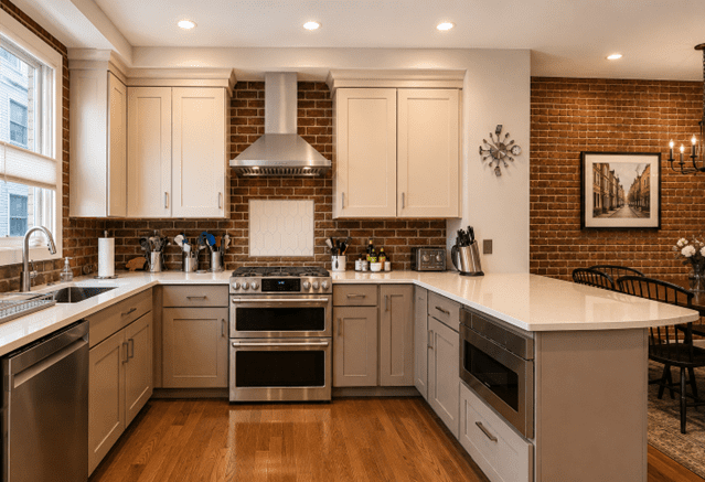
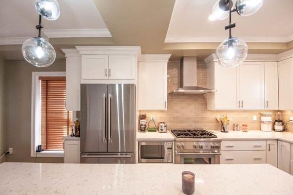
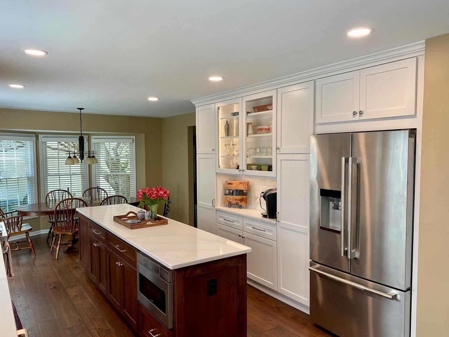
The amount of natural light that flows into your kitchen will influence the tone or depth of color that should be introduced into the space. Kitchens with large, southern exposure windows can tolerate deeper shades of color, while smaller windows with northern exposure (or no windows at all) will dictate very pale shades of color. Keep in mind that a contrast in depth of color, to that of the coloration of the cabinetry is an absolute necessity, as you will want your cabinets and countertops to be more of the focal point. If a reasonable contrast hasn’t been achieved, the overall appearance will be monochromatic, dull and uninspiring.
Return of the Color Wheel!
Yes, go back to your primary school years and find yourself a color wheel or, at least, recall the basic principle of the wheel as it applies to decorating; and this will prevent the ‘violation’ in choosing kitchen colors and textures that was mentioned earlier. The decorating world is basically divided into two distinct families or ‘neutrals’: earth and gray. Every color imaginable falls into one, or the other, neutral. Blues, most reds, etc, fall under the gray neutral while beiges, rusts, yellows fall under the earth neutral; and they marry at a point that is called ‘taupe’—the ultimate neutral because it bridges both sides of the wheel. White (in paint, fabric or finish), oddly enough, will commit to only one of the neutrals. There are gray-whites and earth-whites–which is why ‘just any off-white’ won’t do. So, if your cabinets are white, counters are black and your light fixtures, appliances and sink are stainless, choose your kitchen colors from the gray-neutral part of the wheel; otherwise, expect a visit from the decorating police!
Anchoring Your Scheme with Texture
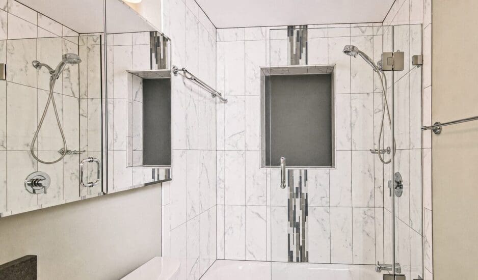
Most folks tend to assume that the concept of texture is something that is a physical trait that is measured by how rough, or smooth, an object feels. In a very remedial sense, this is correct, but it really has more to do with an objects’ ‘refraction of light’. Surfaces with texture reduce lights’ ability to bounce off of it. Highly polished granite or marble has a high degree of refraction (reflective qualities) while coarse woven (burlap-type) window fashions have precisely the opposite effect. Too many shiny surfaces, for example, without being balanced with some measure of texture is not a good decorating scheme. If the countertop is polished granite and the backsplash is glossy tile, consider introducing some low-luster copper decanters, wooden breadbox, wicker or dried floral arrangements to offset the glare of all this sheen.
The desirable result in the kitchen is to integrate a balance of texture to create interest and identity; and this means to utilize elements (like grandmother’s cookie jar) to retard a very shiny, slick appearing kitchen or to insert a polished enamel sink onto a natural soapstone countertop. Quite often, forms of art, window dressings, cutting boards and small appliances are integrated into a kitchen scheme with the intent of creating a textural balance; and the best part about these items is that they can be economically rotated or replaced when small changes are desired.
Areas to Address with Color and Textures
Typically speaking, the cabinetry and countertops are fixed variables in the color and texture scheme of the kitchen; and it should be noted that these two items should be selected together along with a broader understanding of the overall theme of the kitchen décor. Some of the more obvious areas to receive color and texture considerations are: windows, doors, entrance casings, and backsplash areas. These are common elements of a kitchen that, when addressed wisely, will provide the medium where color and texture can be introduced into a kitchen to create an appealing balance in the overall decor. Also calculated into the color formula is the kitchen flooring. The general rule here is that the flooring needs to be the foundation by which the remainder of the room is built upon: darker if the walls and cabinets are light and light when the cabinets and walls are dark (or if floor space is minimal). One area that is so often neglected is that of a kitchen ceiling. Not only can the ceilings become a centerpiece with a ‘can’ design or even dressed-up in high fashion with a detailed copper overlay, but simply addressing it with a pale accent color (as opposed to plain-old ceiling white) can do wonders for adding that bit of color and texture panache that your new kitchen is begging for!